Liquid Glass at Scale: 1 Component Across 3 Mobile Platforms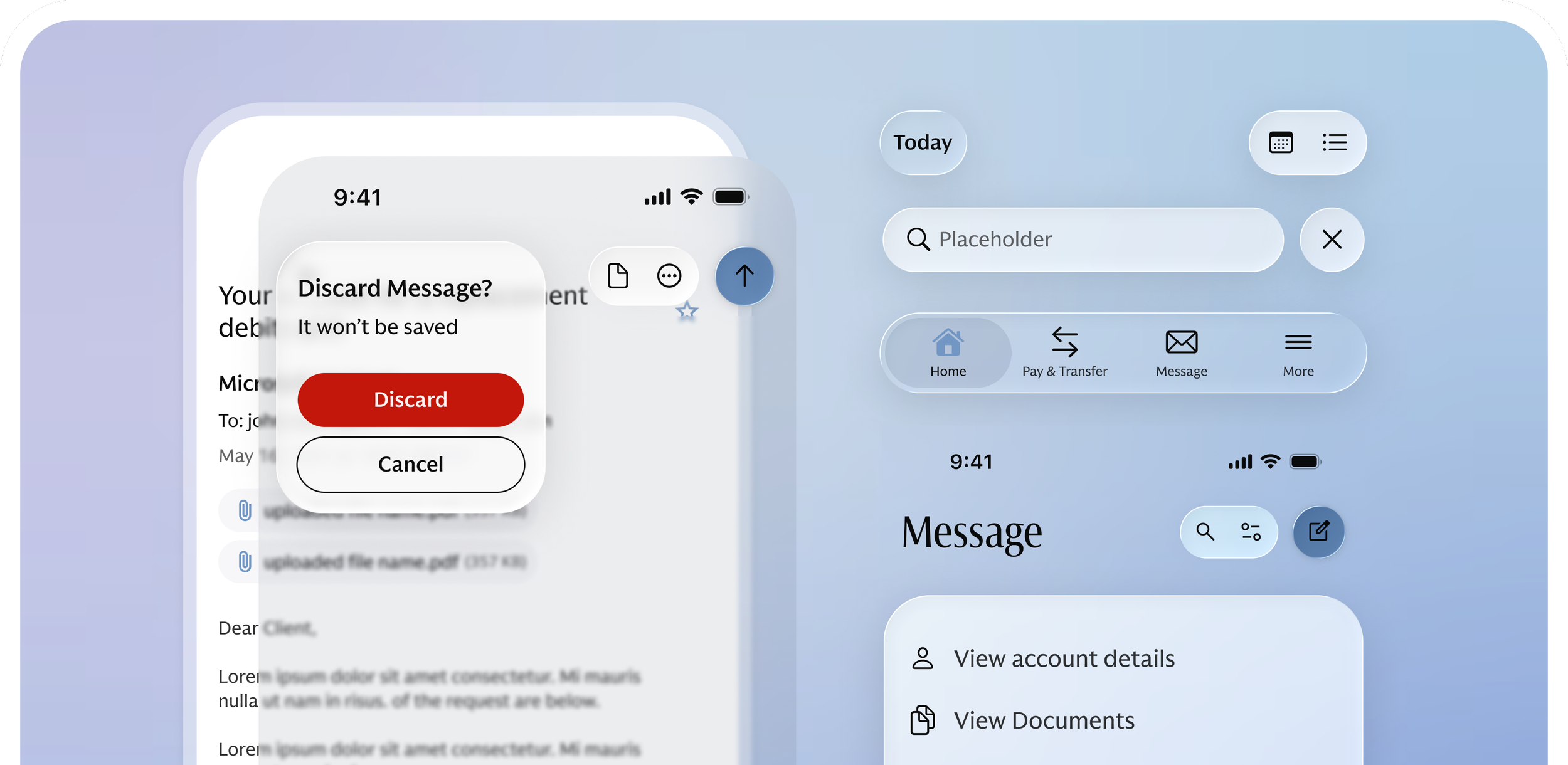
Apple’s iOS 26 introduced Liquid Glass, new native controls, and a fundamentally different relationship between interface and content. I led the adaptation of the GS mobile design system for iOS 26 without leaving iOS 17+ and Android behind.
One system, three platforms
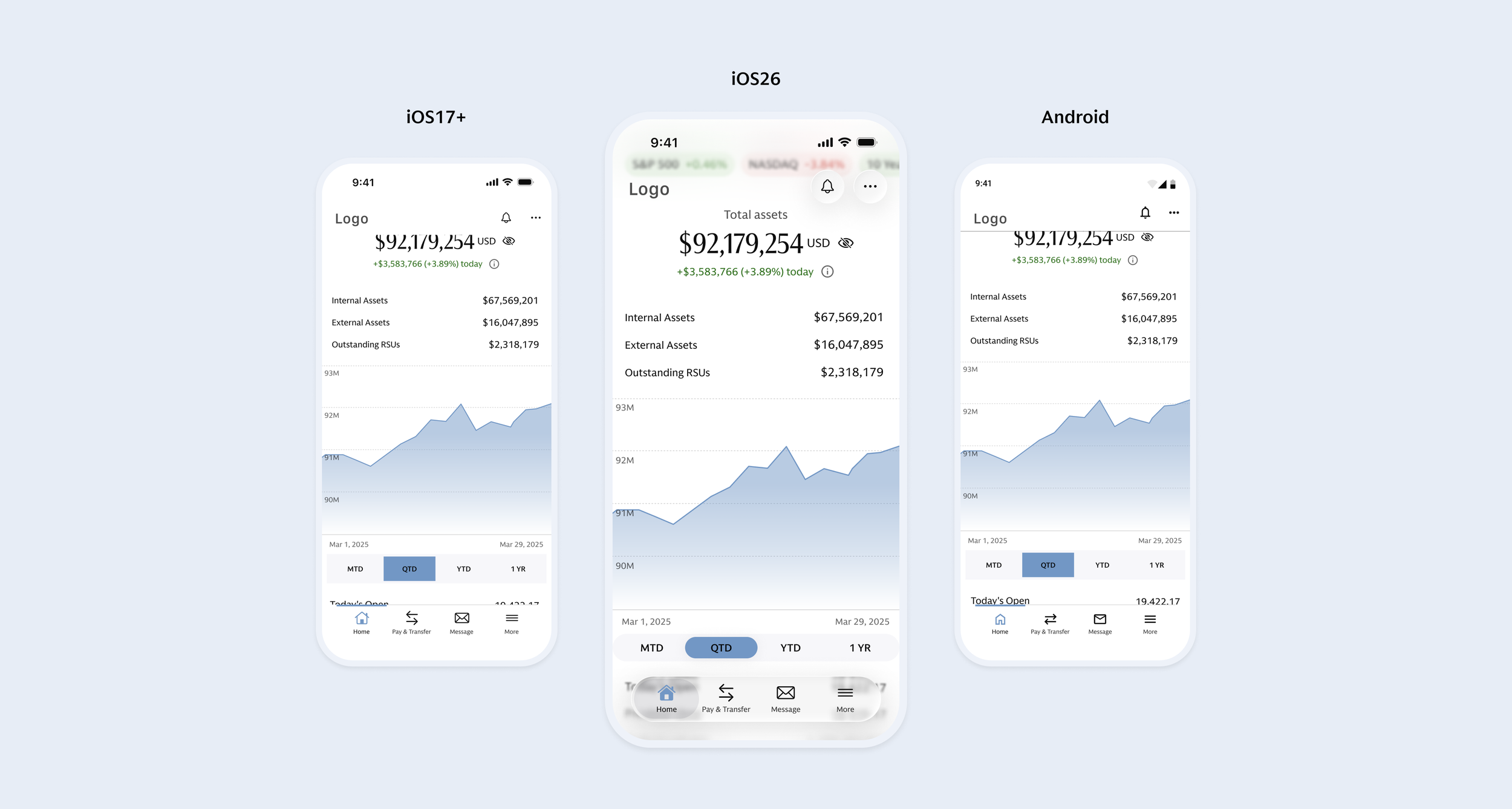
I defined an architecture that let designers switch between iOS 26, iOS 17+, and Android within the same component.
Bringing in Liquid Glass
I turned Apple’s new visual language into reusable rules for glass, legacy support, and native behavior.
From Figma to production
I owned iOS design and VQA, partnering with engineering to refine components through implementation and launch.
Roles & Responsibilities.
Design lead on a 3-person team. I led the platform architecture, iOS 26 adoption, and final VQA, while partnering with the team on documentation.
Duration
Sep 2025 - Aug 2026
Team
GS Design System Team | Multiple Product Teams | Engineering
Tool
Figma | JIRA
The Challenge
iOS 26 introduced more than Liquid Glass, it challenged how OneGS could evolve across platforms, design languages, and real delivery constraints.
01. Platform
Support iOS 26, iOS 17+, and Android in one scalable system that could continue absorbing future platform changes.
02. Design
Define where Liquid Glass belonged while preserving GS branding, hierarchy, and patterns that needed to remain consistent.
03. Delivery
Balance the new platform vision with technical constraints, existing functionality, and a fixed delivery timeline.
The Solution
A platform-aware component system that brings Liquid Glass into the existing OneGS architecture, allowing designers to switch between iOS 26, iOS 17+, and Android within the same component—without rebuilding or maintaining separate libraries.
01. Platform
How could one system absorb platform change without becoming multiple systems?
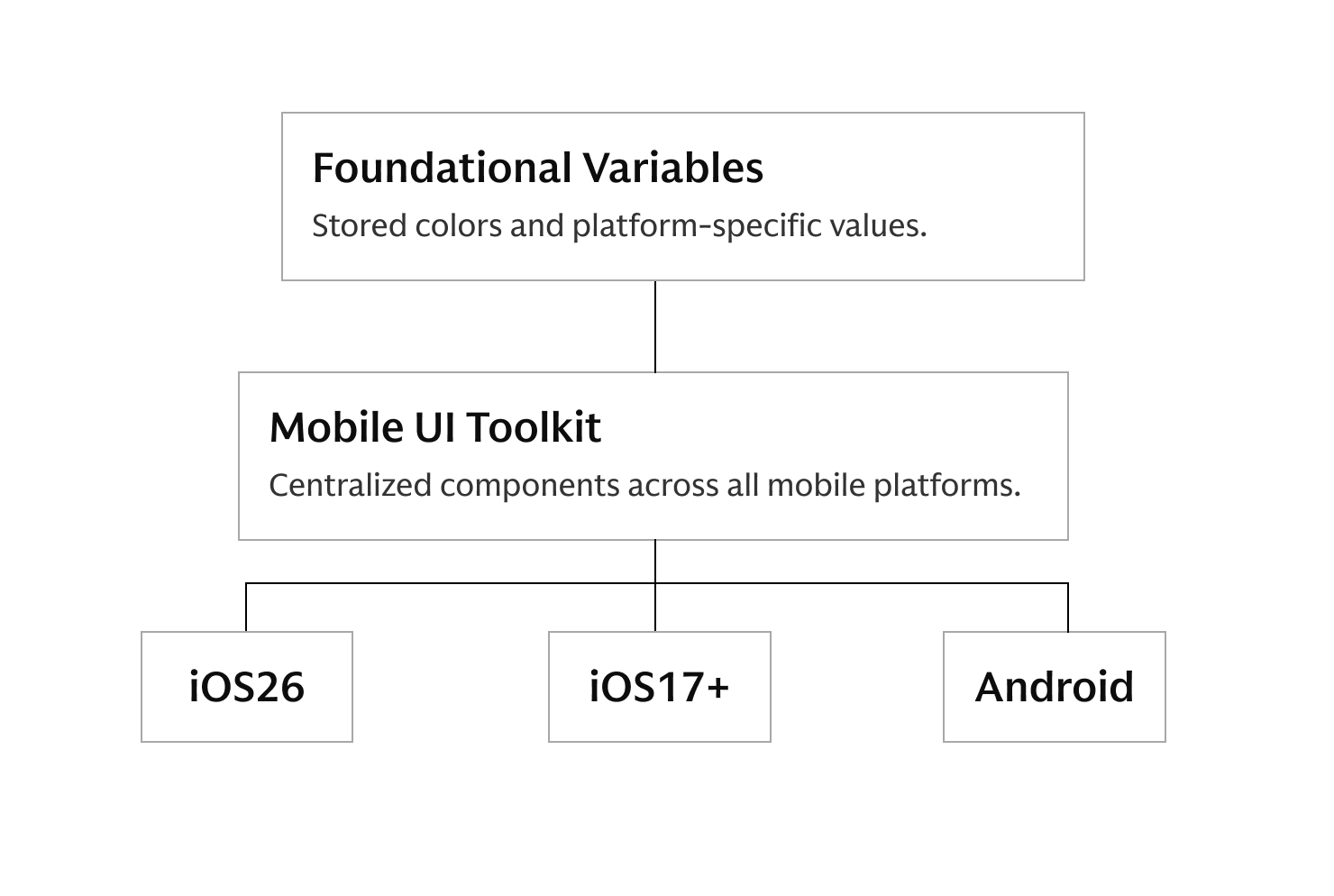
The foundation had to become platform-aware first.
Making one component work across three platforms required more than variants. I separated product theming from platform logic, creating a dedicated Mobile Platform foundation for iOS 26, iOS 17+, and Android.
Components could inherit the right platform values while keeping the same structure.
Shared product theme + platform-specific expression.
Designers can switch between iOS 26, iOS 17+, and Android in one click without searching for or rebuilding separate components.
02. Design
Where should Liquid Glass actually be used?
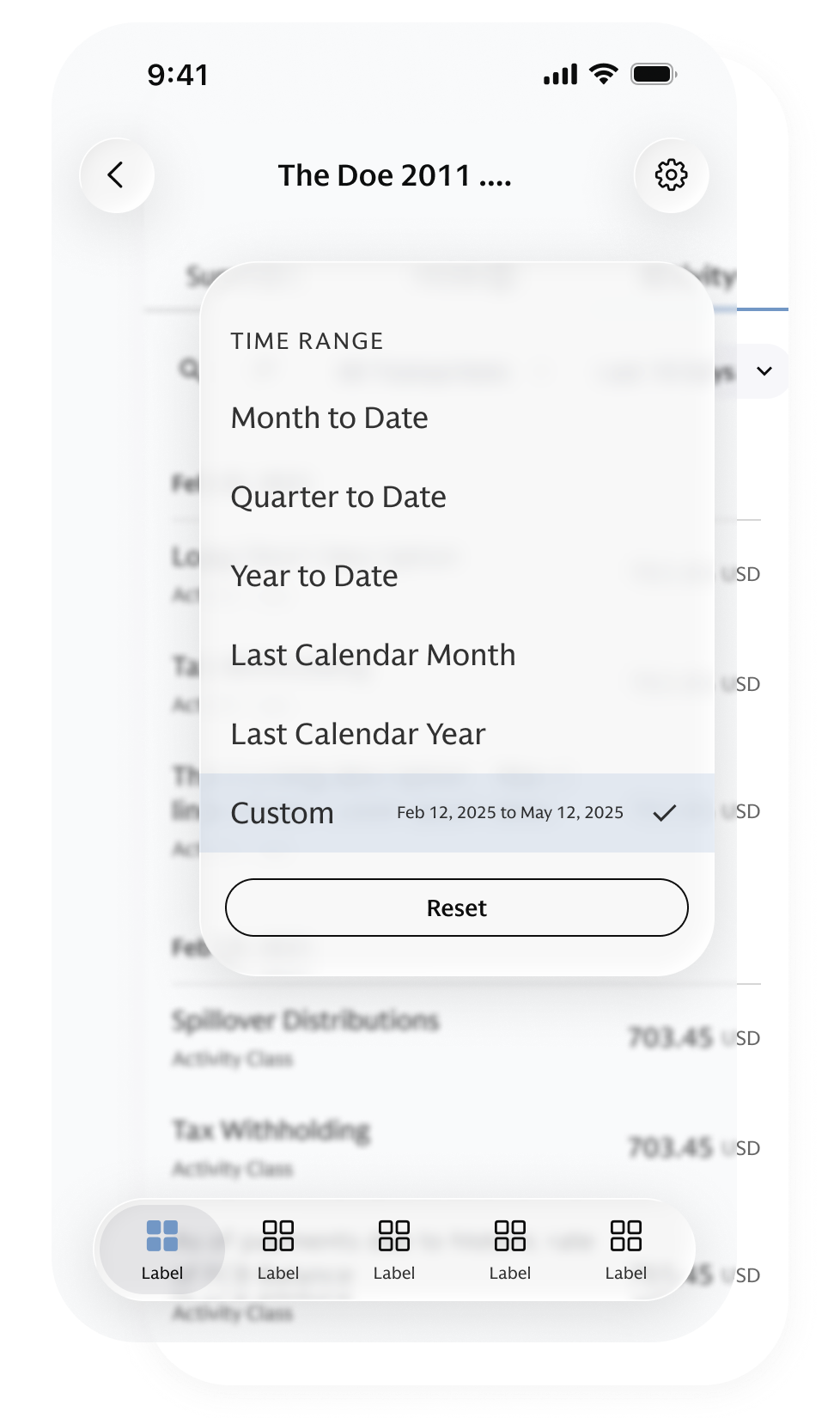
Glass for interface. Solid for content.
Applying glass everywhere would create visual noise and weaken hierarchy especially in information-dense financial products.
So I treated Liquid Glass as a hierarchy decision, not a visual style.
Elevated interface controls: such as global navigation and floating actions - could use glass when they sat above content.
Content-level controls generally remained solid when they belonged directly to the information layer.
Glass followed hierarchy - not component type
This turned Liquid Glass into a repeatable system rule rather than a one-off visual treatment.
03. Delivery
How much should change & how much should stay?
Not everything needed to be redesigned.
iOS 26 introduced new native behaviors, but not every component should follow Apple completely. We had to balance platform conventions, GS branding, existing functionality, technical feasibility, and delivery constraints.
So I used a Native / Wrapped / Custom framework to decide where to follow the platform, where to preserve GS, and where custom design was worth the investment.
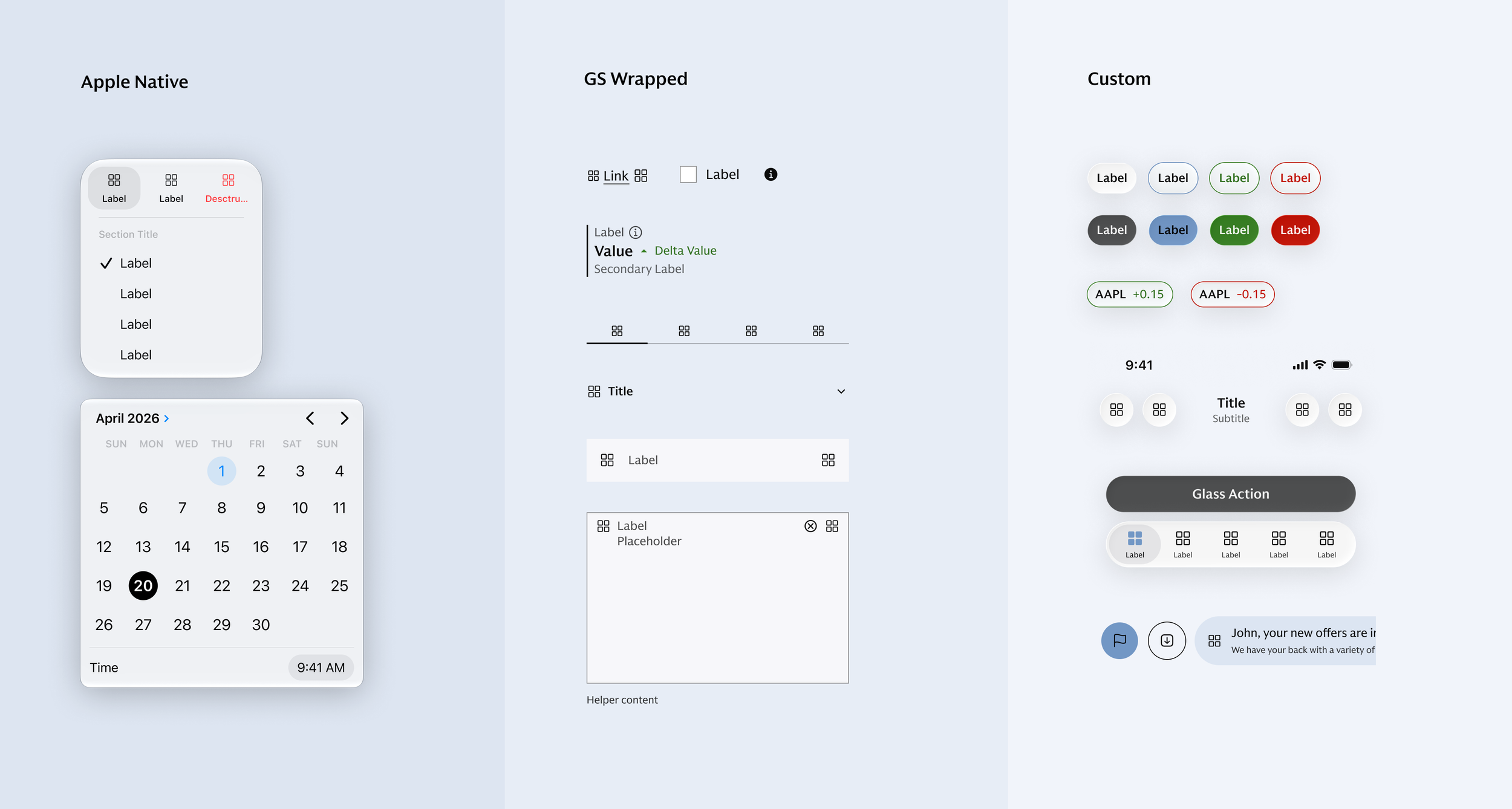
Native (Apple)
Use Apple-native components when behavior and accessibility matter most.
Wrapped (GS)
Use the existing core component with a GS layer for controlled styling and configuration.
Custom
Create tailored solutions when iOS 26 updates require rethinking components to better align with the GS visual language.
A clear decision framework
The framework reduced unnecessary redesign, preserved GS consistency, and made future implementation more efficient.
Before scaling the system, we tested the rules in practice.
Rather than updating all 35+ components at once, we started with a focused set that exposed different platform dependencies. Here are 3 examples of how the rules held up in practice:
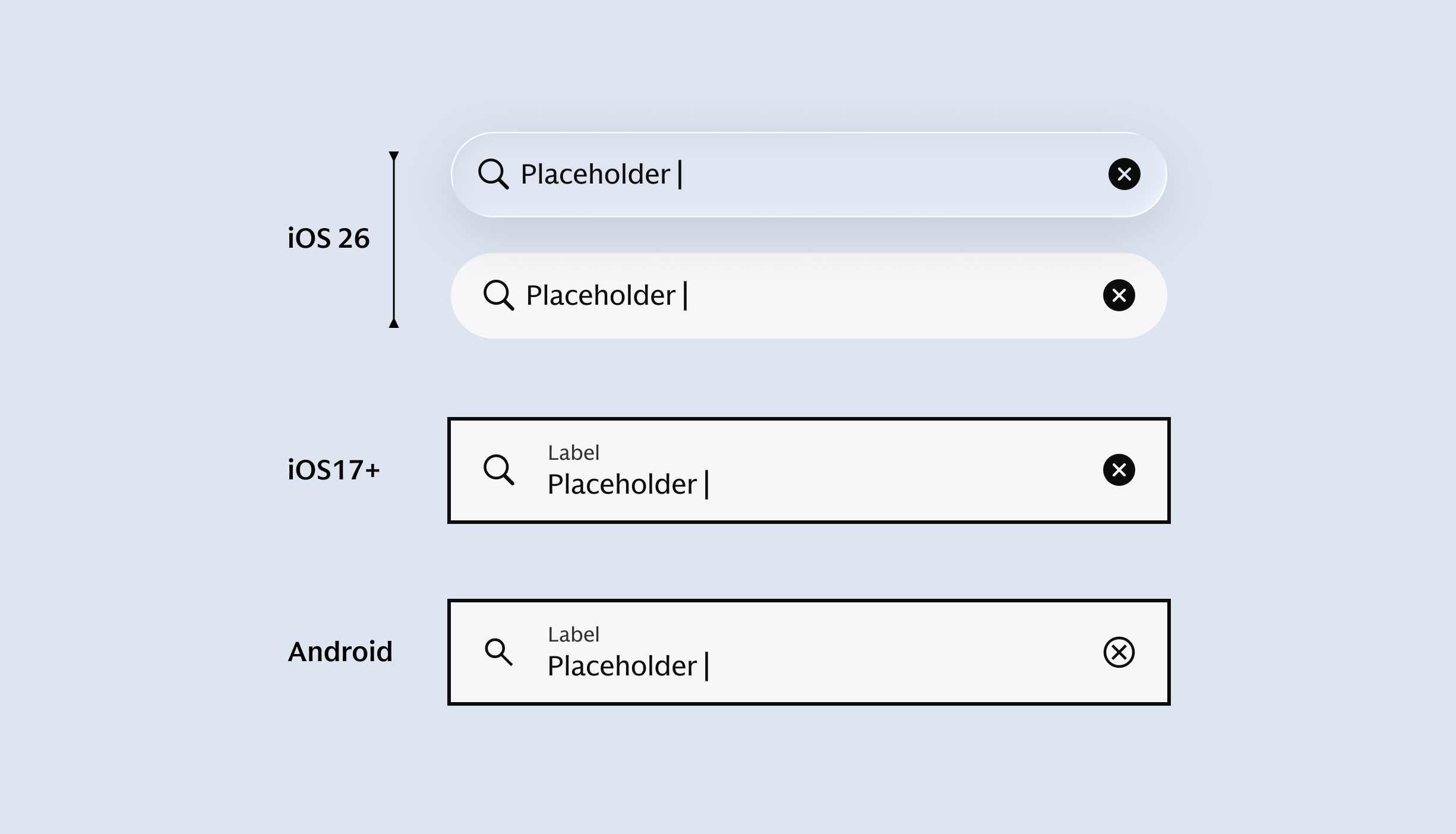
Search
What happens when the same component plays two different roles?
Global search sits above content; inline search lives within it.
Decision: Use glass for global search, keep inline search solid.
Solved: Clear hierarchy without overusing Liquid Glass.
Tab Bar
What happens when consistency fights native behavior?
A shared interaction would make both platforms feel less native.
Decision: Let iOS26 follow Apple’s behavior while Android keeps its own pattern.
Solved: Shared intent, native expression.
Segmented Control
What happens when iOS 26 conflicts with legacy support?
The new proportions no longer fit the existing control.
Decision: Add a iOS 26 variant while preserving iOS 17+.
Solved: New platform support without forcing legacy migration.
The Goal
Find the rules that could unlock the rest of the system and strengthen them as edge cases emerged.
Once the rules held up, we asked a bigger question:
Can the system scale beyond the team that created it?
As we expanded the architecture across the broader mobile toolkit, the design problem shifted from making components work to making decisions repeatable.
It was no longer:
“Can I make this component work?”
→
It became:
“Can another designer make the right decision independently?”
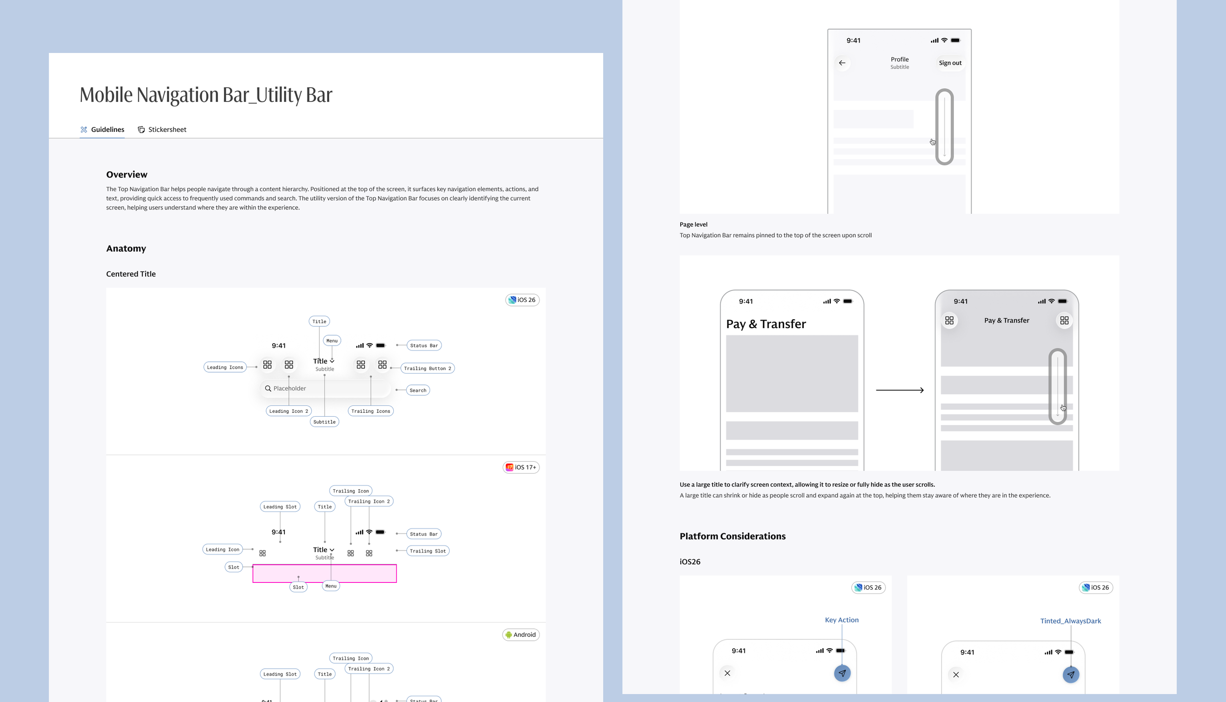
The system had to scale the decisions - not just the components.
Platform properties, naming, component structure, usage guidance, documentation, and behavior all needed to reinforce the same mental model.
Figma wasn’t the finish line. Production revealed what static components couldn’t.
I owned iOS VQA and partnered closely with engineering as components moved from Figma into implementation.
Testing focused on 3 areas:
Platform behavior — OS versions, native interactions, and accessibility.
Visual & interaction states — light/dark modes, component states, and responsive behavior.
Real product use cases — production configurations that surfaced edge cases we couldn’t fully anticipate in Figma.
Those findings didn’t just fix implementation issues, they helped refine the component rules, documentation, and sometimes the design itself.
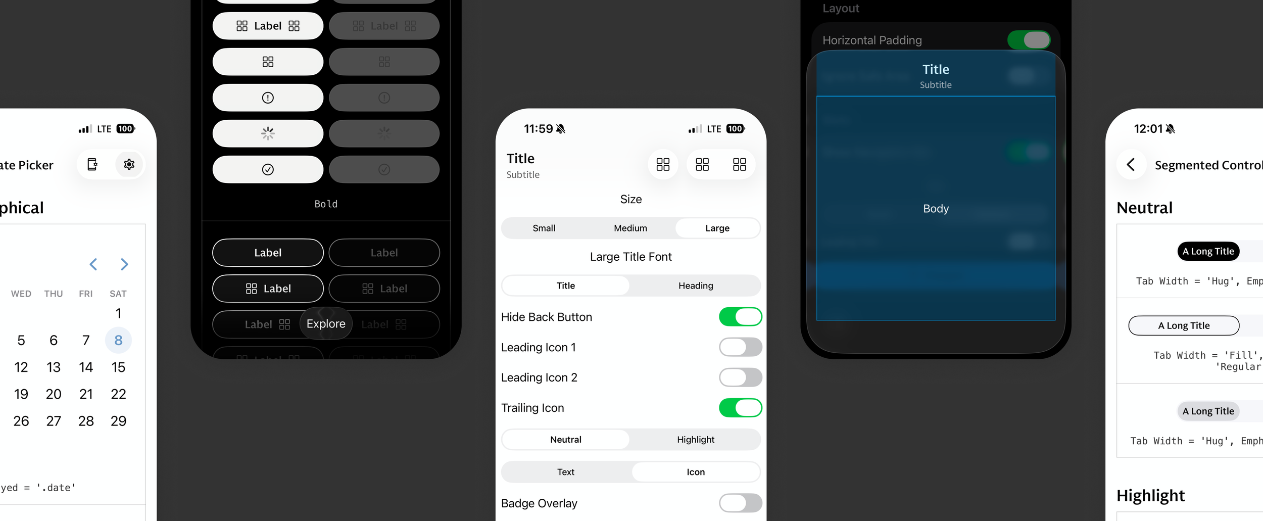
Design informed code. Code challenged the design.
The feedback loop made the system stronger before launch.
What did this unlock?35+Components scaled across the system
3+Product teams supported at launch
3Platforms supported through one architecture
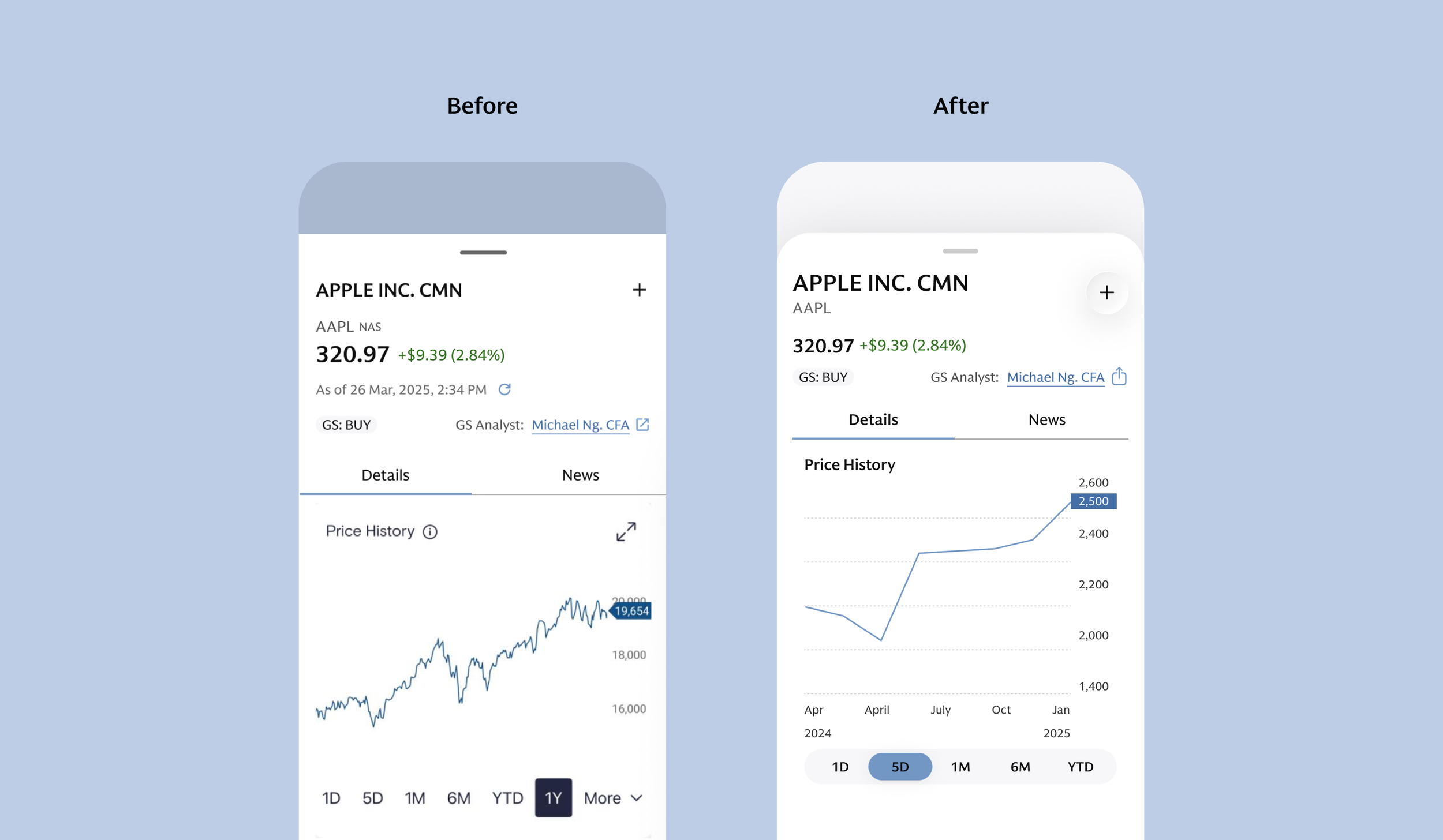
The visible change was Liquid Glass.The real work was evolving the system beneath it.
What began as an iOS 26 update evolved into a broader mobile toolkit transformation, using a scalable architecture designed to absorb future platform changes without disrupting existing workflows. The updated system officially launched in August 2026.
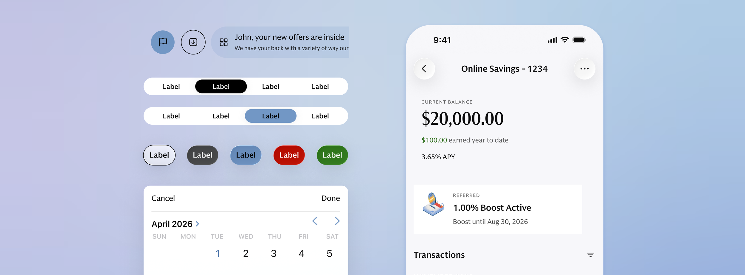
Consistency doesn’t mean sameness.
A shared system works best when platforms share intent and structure, not identical pixels. Native behavior can vary without weakening the overall product language.
Foundation decisions scale further than component decisions.
Separating product theming from platform logic made future changes easier to absorb without rebuilding the library component by component.
Learnings & Reflections.
Production is where the system gets honest.
Some of the most important decisions surfaced only after design met engineering. Balancing native behavior, technical constraints, and design intent often revealed better solutions than the original Figma spec.
Real use cases make shared systems stronger.
Working with different product teams helped uncover needs the core system couldn’t predict on its own. Understanding how components behaved in real product contexts made the toolkit more flexible and relevant across teams.